Head of Clouds is an independent music production label. It’s philosophy it’s based on a collaborative creative method meaning that from one song there can be different perspectives and ways to approach it. This project included the design of the brand’s logo and a visual interpretation of the first single release.
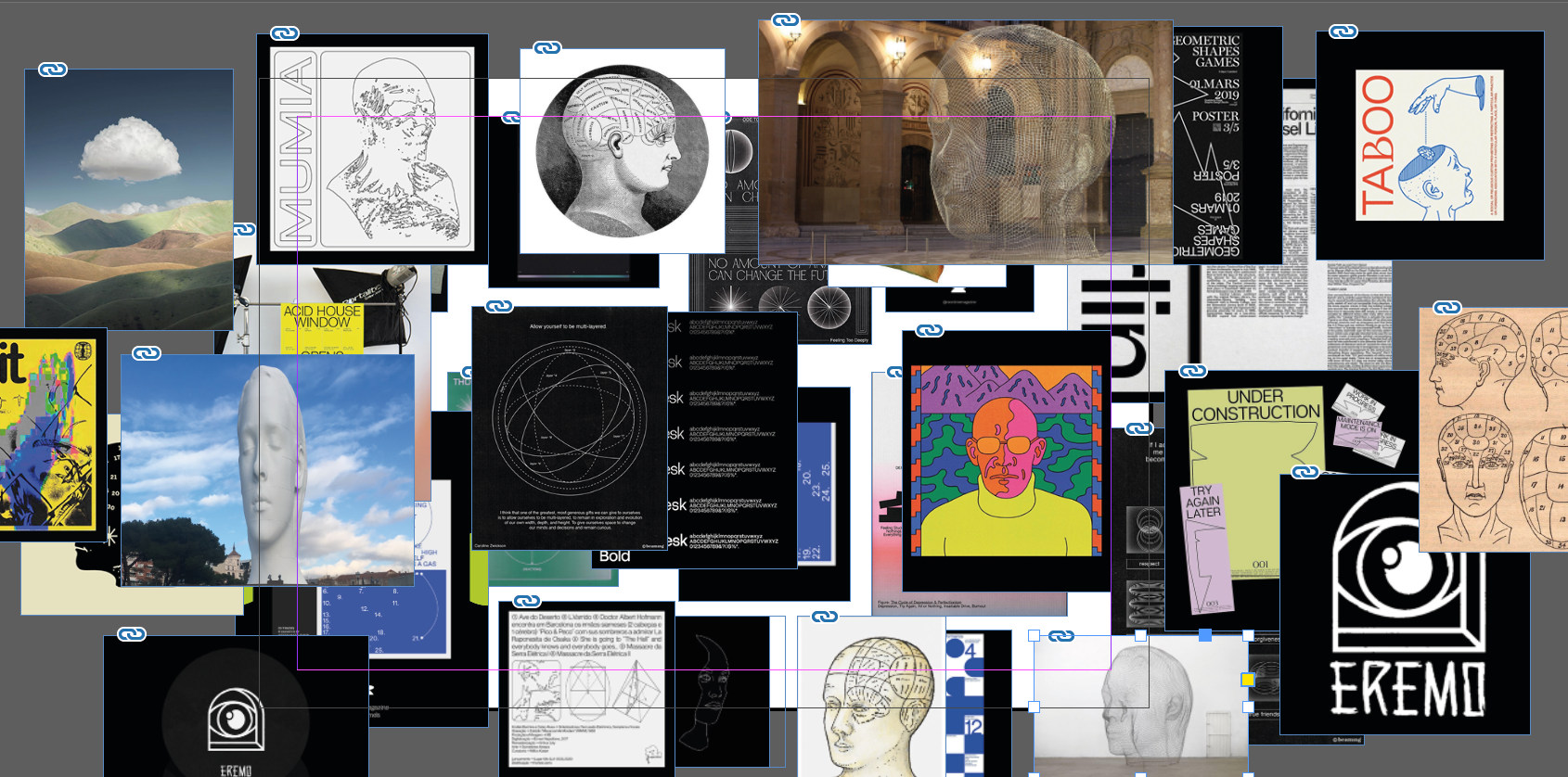 Design process
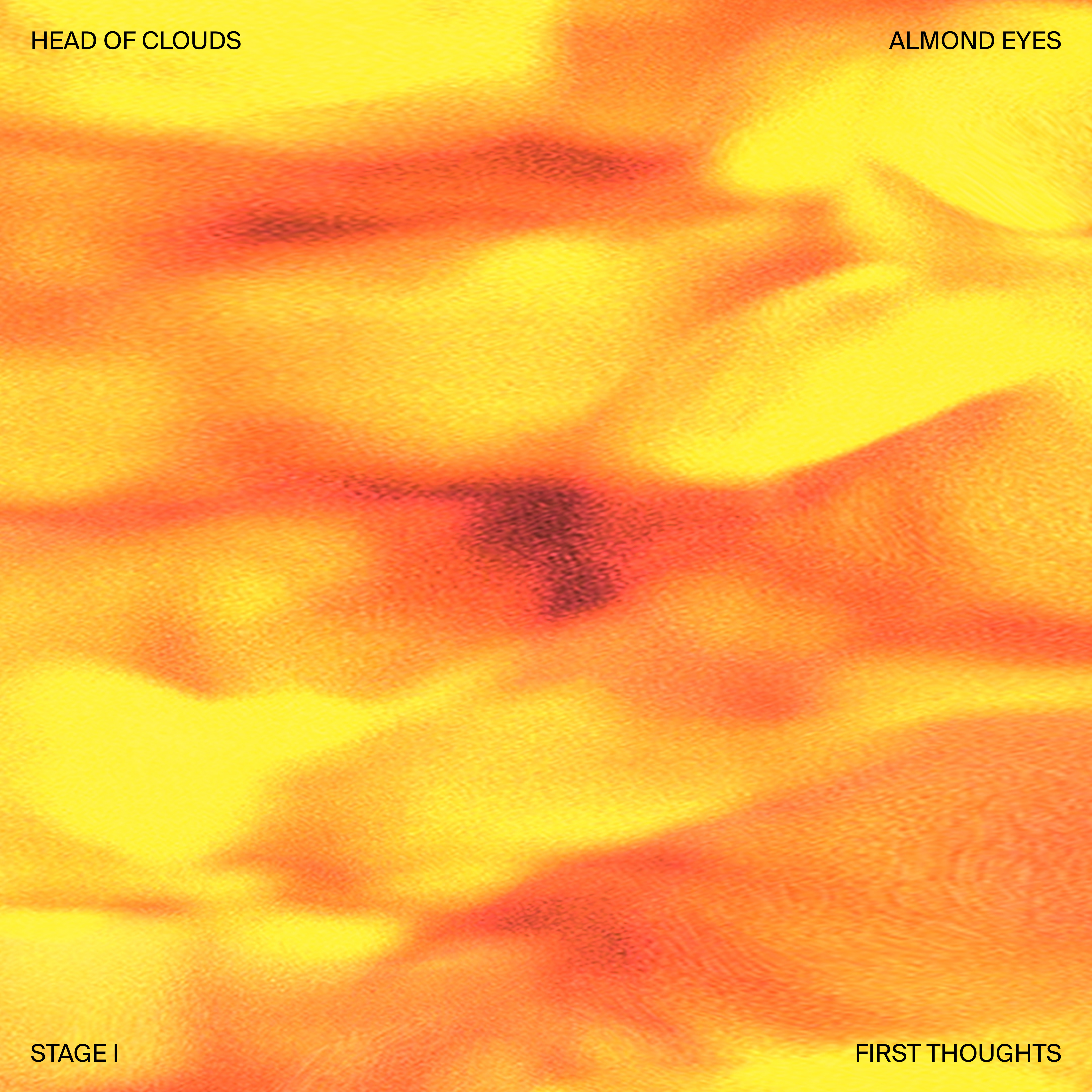
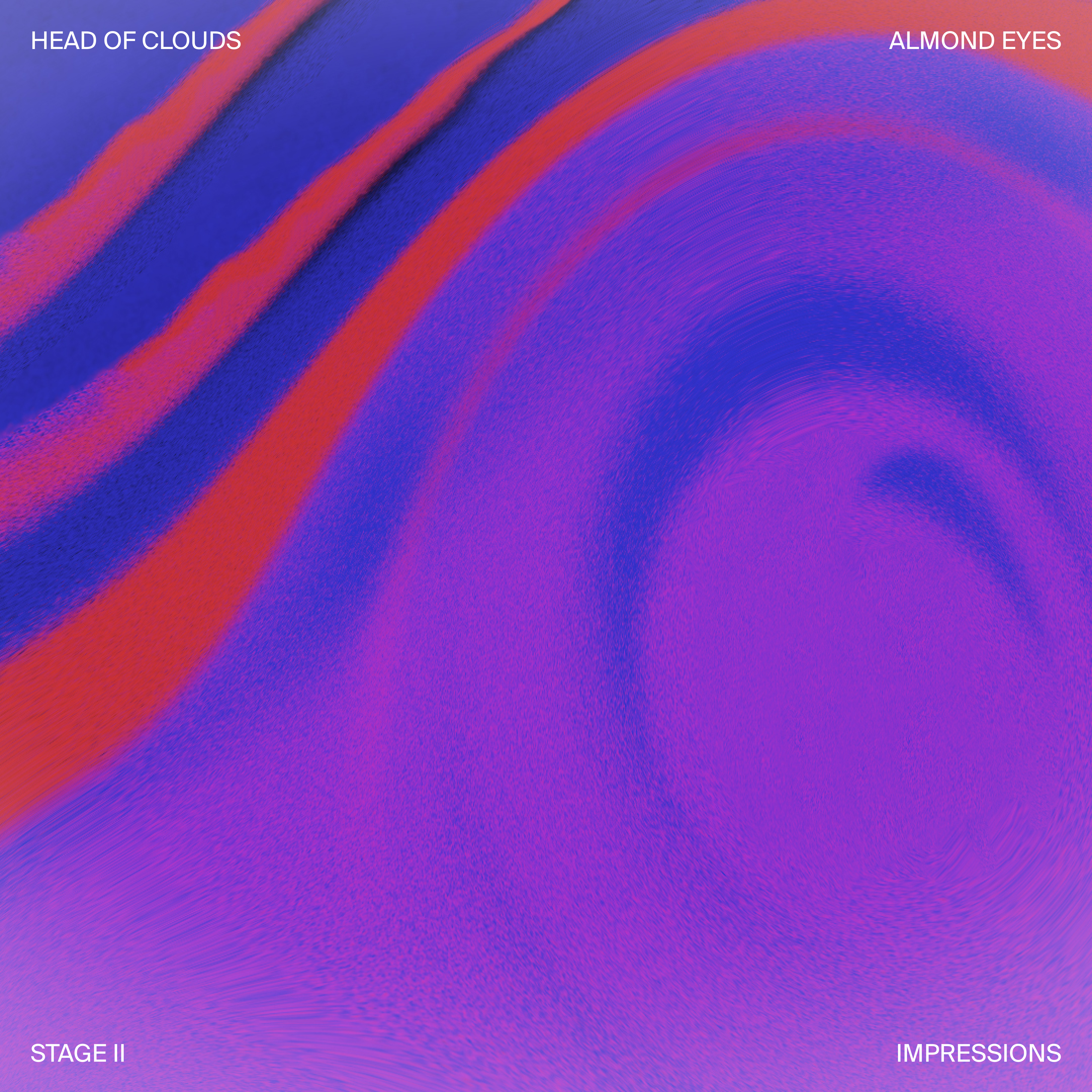
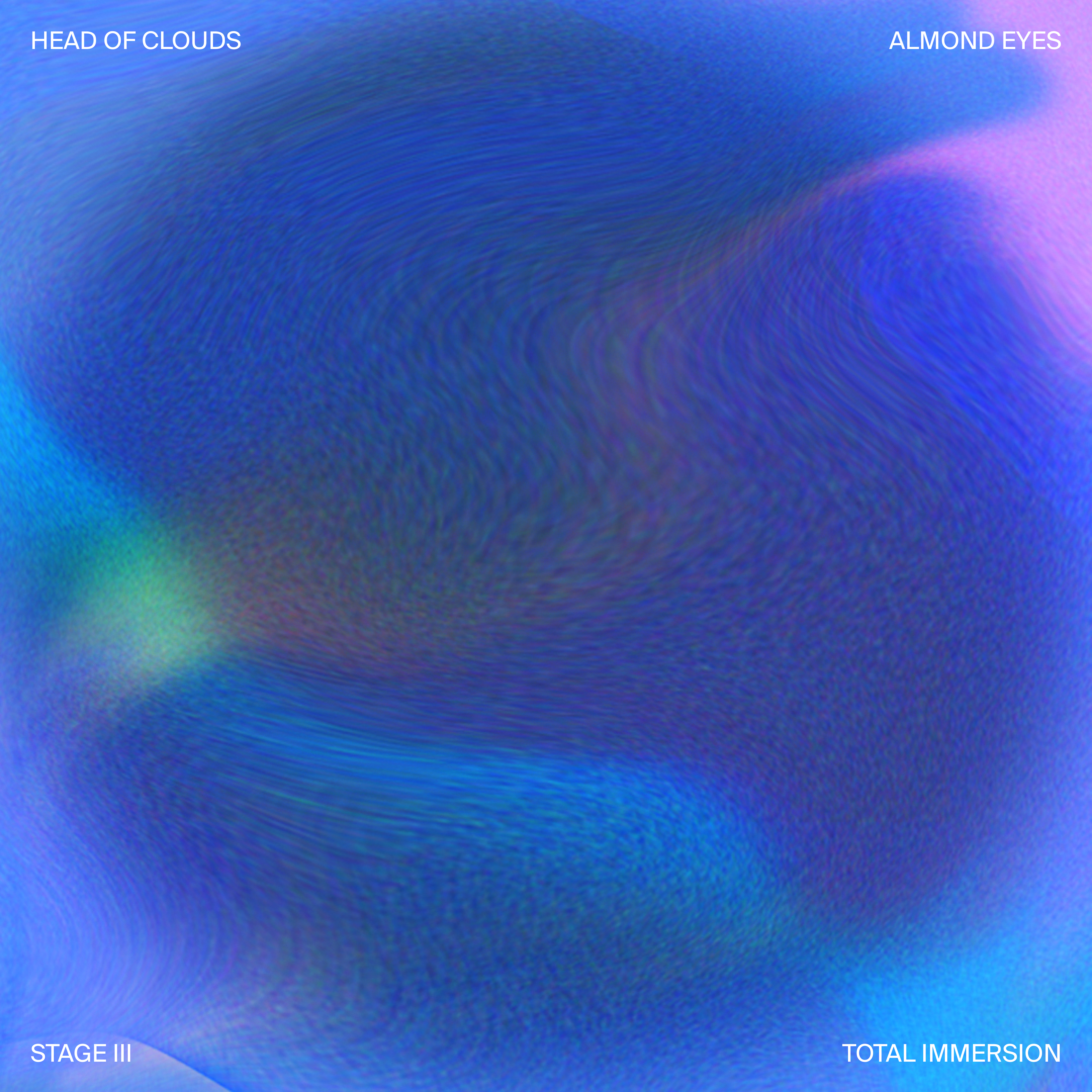
1st song release graphic interpretation:
“When I listened to Almond Eyes I felt an emotional wave throughout the whole song. It was like when you first meet someone. You feel the energy of the unknown, some first thoughts start hitting you and pushing you forward to getting to know that person. Then, all of a sudden you fall into a warm spiral that leads your first impressions to the deepest immersion into that person. This is what Almond Eyes reminded me and my intention was to visualize these feelings accordingly to the melody and stages of the song. Hope you felt the same.”